Harley-Davidson Tank Emblems & Logo’s
What year is your Harley-Davidson?
This page offers a complete timeline of Harley-Davidson’s tank emblems and logos from 1919 to 1993. These iconic designs are more than just visual elements—they reflect the brand’s evolution, cultural influences, and technological milestones over the decades.
Explore each emblem, from the early hand-painted scripts to the bold, aviation-inspired designs of the 1990s. Each section provides historical context, design details, and images, giving you a closer look at how Harley-Davidson’s identity has been shaped through the years.


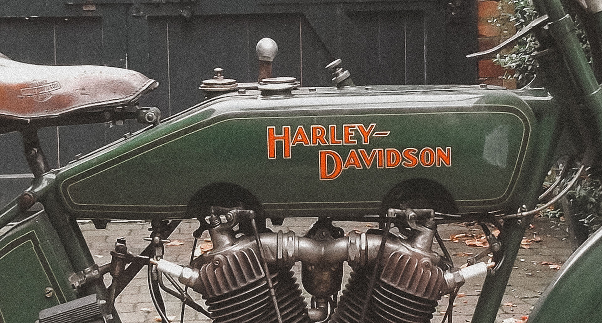
1919: The Classic Beginnings – Early Script
Used from 1919 to 1933.
In 1919, Harley-Davidson introduced its first widely recognized tank emblem: a simple, hand-painted script proudly displaying the “Harley-Davidson” name. This minimalist design set the foundation for the brand’s visual identity, reflecting the straightforward and rugged spirit of early motorcycling.


1933: The Bird Motif
Used from 1933 to 1934.
The 1933 "Bird Motif" emblem introduced a winged scroll design around the "Harley-Davidson" name, adding elegance and movement to the brand’s image. Created during the Great Depression, it symbolized resilience and freedom, reflecting Harley’s enduring spirit. Though used for just one year, this intricate design remains a collector’s favorite and a testament to Harley-Davidson’s ability to innovate during challenging times.

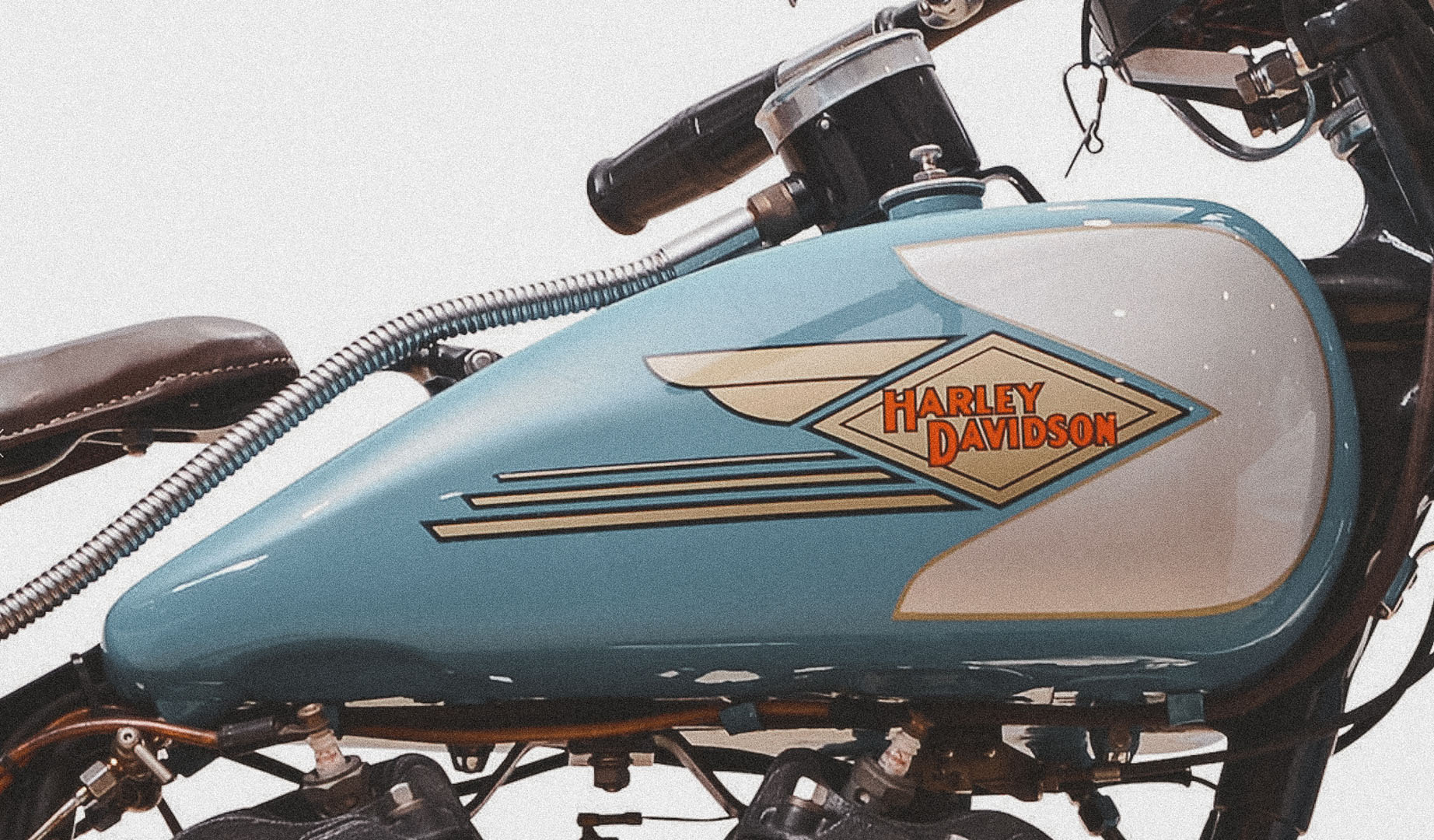
1934: The Flying Diamond
Used from 1934 to 1938.
In 1934, Harley-Davidson introduced the "Flying Diamond" emblem, a clean, geometric design inspired by the Art Deco movement. This emblem replaced the ornate Bird Motif of 1933, signaling a shift toward modernity and streamlined aesthetics. With its bold, angular shape, the Flying Diamond reflected Harley’s forward-looking approach and became a defining symbol of the era.

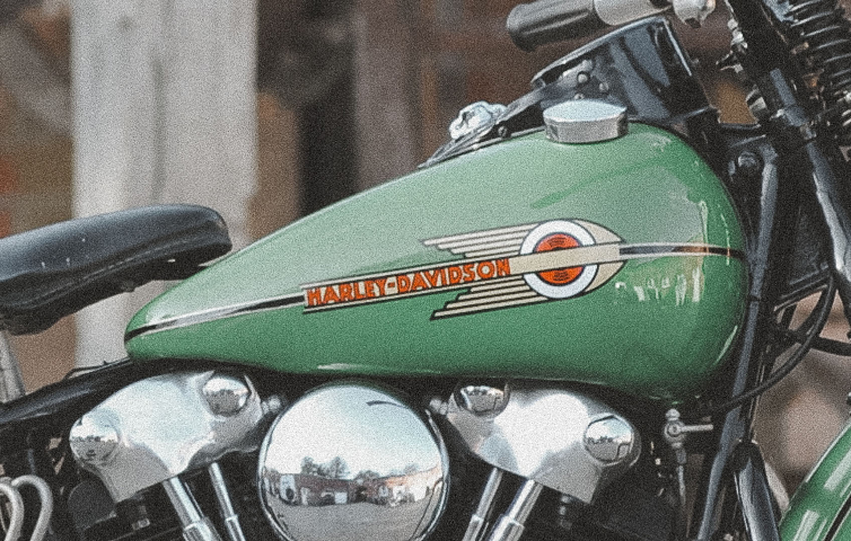
1938: The Streamlined Look
Used from 1938 to 1946.
In 1938, Harley-Davidson unveiled a sleeker, more streamlined tank emblem to coincide with the debut of the Knucklehead engine. This design featured clean lines and refined lettering, emphasizing power, precision, and modern engineering. The streamlined look marked a new era for Harley-Davidson, showcasing innovation and setting a bold standard for motorcycle design.

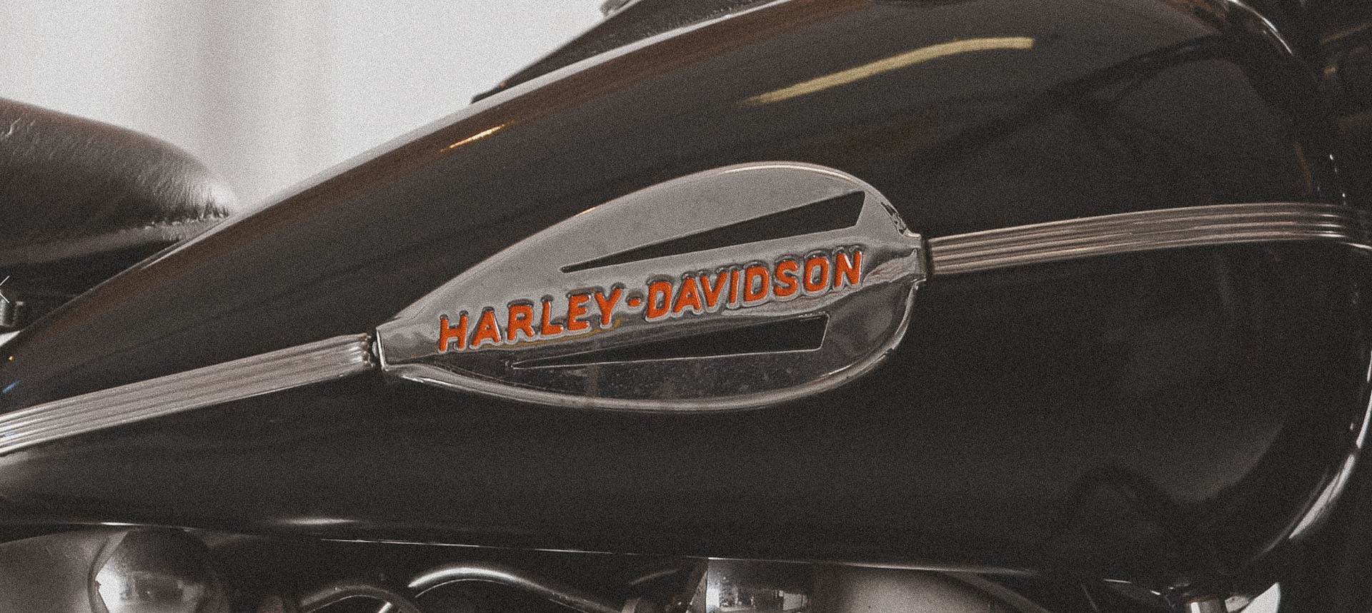
1946: The First Metal Badge
Used from 1946 to 1948.
In 1946, Harley-Davidson introduced its first-ever metal tank badge, symbolizing durability and craftsmanship in a post-World War II era. This rugged design reflected the brand’s commitment to quality and resilience during a time of rebuilding. Highly sought after by collectors today, the 1946 metal badge stands as a milestone in Harley’s evolution, blending functionality with timeless style.


1948: Panhead and Hydra-Glide Era
Used from 1948 to 1951.
In 1948, Harley-Davidson debuted a simplified tank emblem to mark the beginning of the Panhead engine era and the introduction of the Hydra-Glide front suspension. This minimalist design mirrored the streamlined aesthetic of the time while highlighting Harley’s focus on modern engineering and innovation. The 1948 emblem remains a classic, representing a pivotal moment in Harley-Davidson’s history.

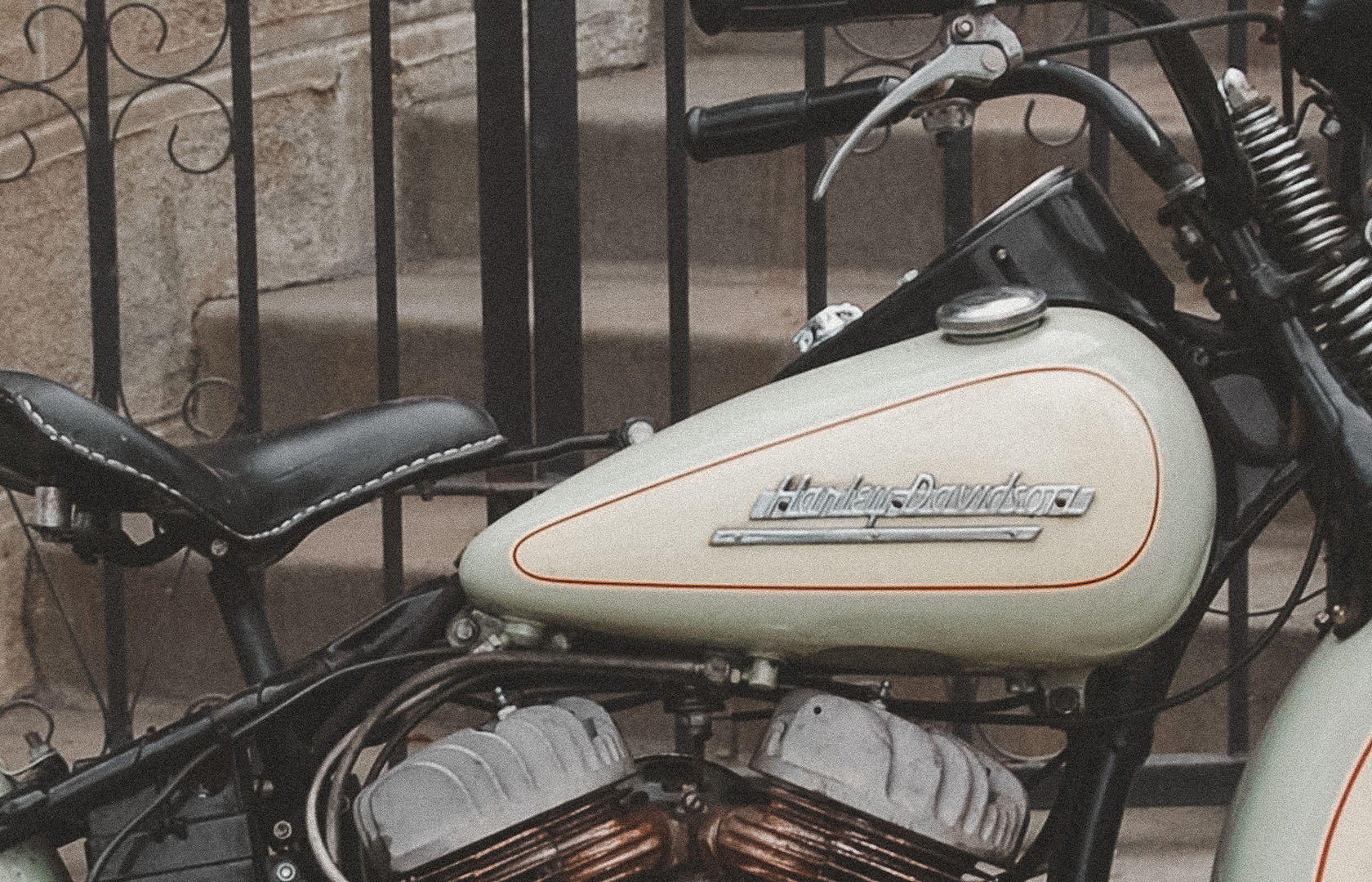
1951: The Script Era
Used from 1951 to 1955.
The 1951 tank emblem introduced an elegant script design that became one of Harley-Davidson’s most refined and stylish logos. The flowing, cursive lettering exuded sophistication and reflected a more polished brand identity. This design set a new standard for Harley’s aesthetic and quickly became a favorite among enthusiasts, cementing its place as a timeless classic.

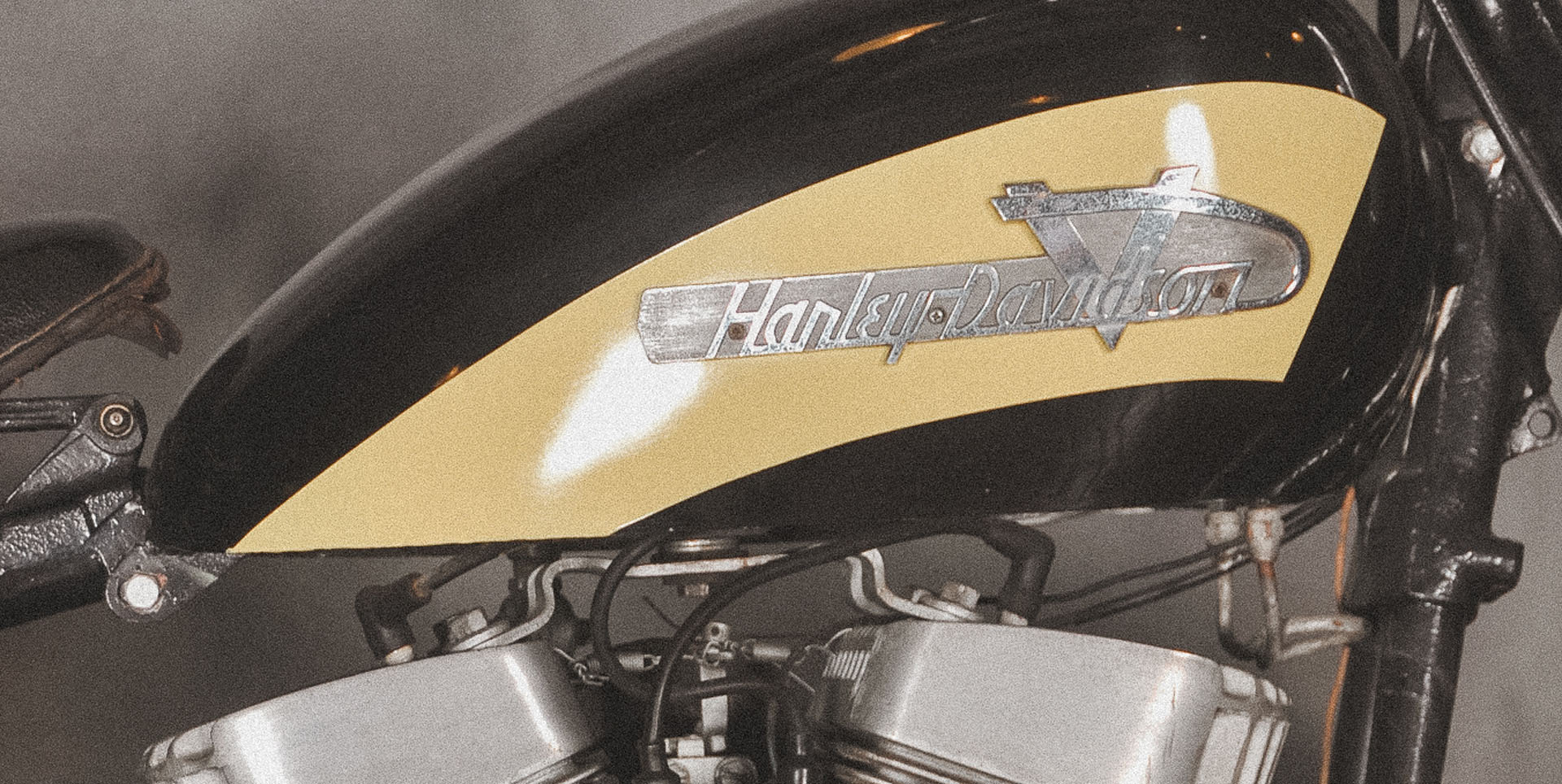
1955: The V-Twin Tribute
Used from 1955 to 1958.
In 1955, Harley-Davidson introduced a bold new tank emblem featuring a prominent "V" in the background, paying homage to the iconic V-Twin engine. This design celebrated Harley’s engineering legacy and its reputation for powerful, high-performance motorcycles. The V-Twin tribute became a fan favorite, emphasizing the brand’s identity as a leader in innovation and performance.

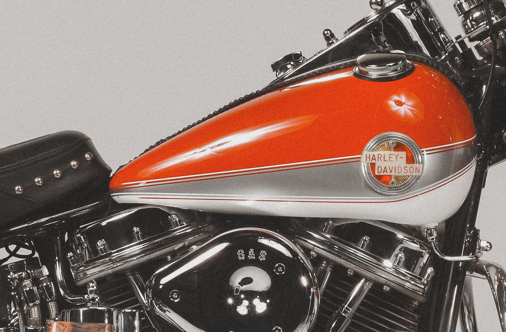
1958: Duo-Glide and Sportster Debut
Used from 1958 to 1959.
In 1958, Harley-Davidson introduced a circular tank emblem to mark the launch of the Duo-Glide and Sportster models. This design often accompanied two-tone paint schemes, giving the motorcycles a distinctive and custom look. The circular emblem represented Harley’s willingness to experiment with fresh designs while maintaining its commitment to style and performance.

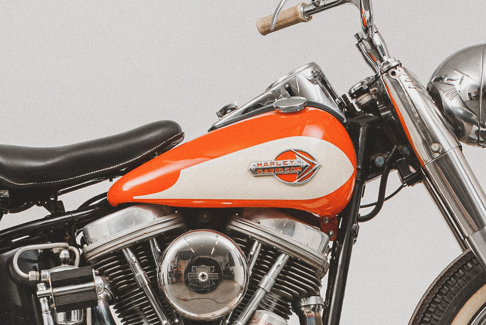
1959: The Arrowhead Emblem
Used from 1959 to 1962.
In 1959, Harley-Davidson introduced the Arrowhead emblem, a bold design featuring sharp lines and vibrant colors. The arrowhead shape symbolized speed and forward momentum, aligning with Harley’s reputation for power and performance. This striking emblem became a hallmark of the era, showcasing Harley’s evolving, expressive branding.

1962: The Gun Sight Logo
Used from 1962 to 1964.
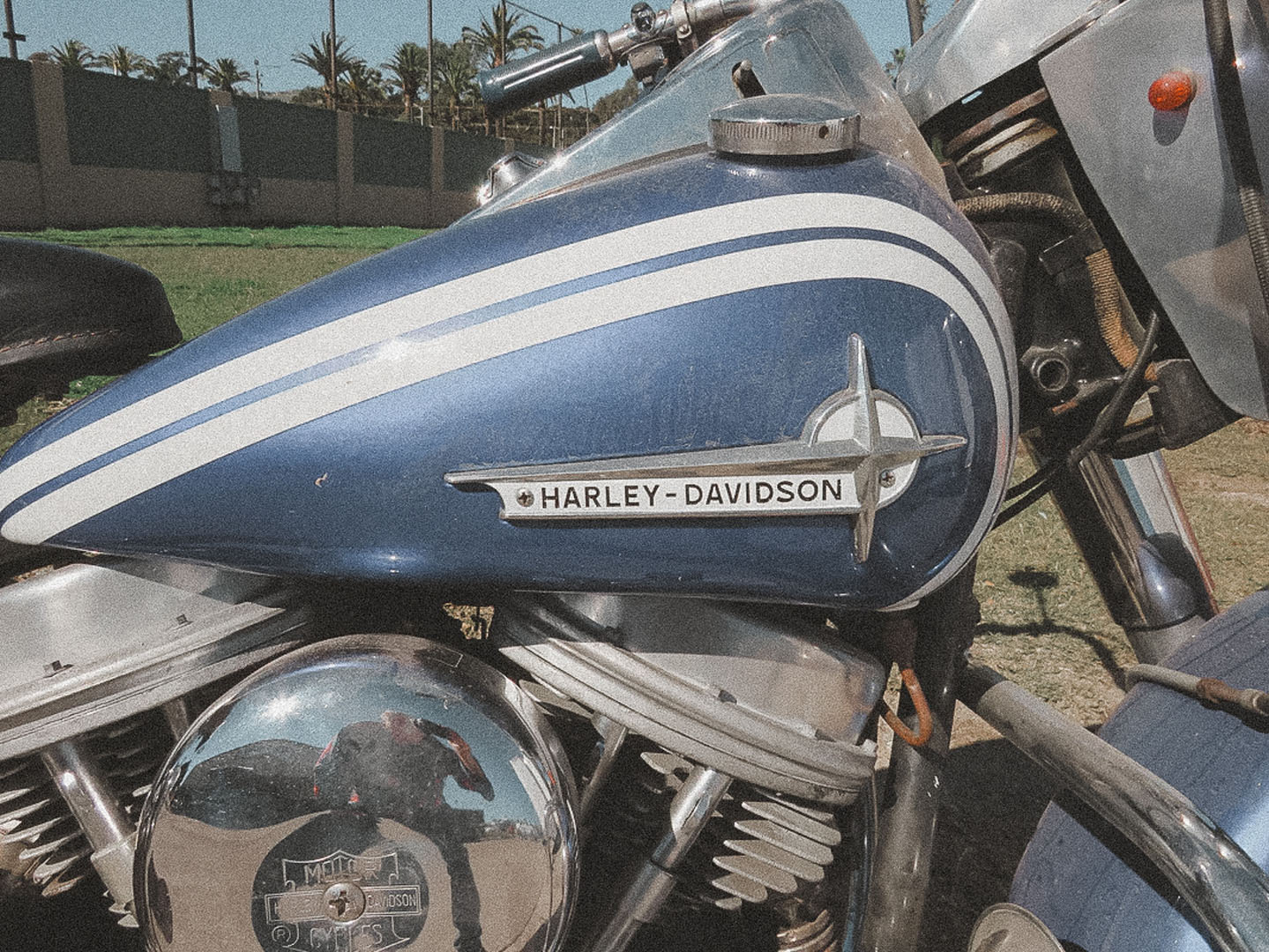
In 1962, Harley-Davidson introduced the "Gun Sight" logo, a minimalist tank emblem featuring a circular target design. This simpler and less colorful logo symbolized precision and focus, aligning with Harley's clean, no-frills approach to motorcycle manufacturing at the time. While it received mixed reactions for its understated appearance, the Gun Sight logo remained on tanks until 1964 and marked a period of refinement in Harley-Davidson's branding.

1964: The Arrows of Change
Used from 1964 to 1969.
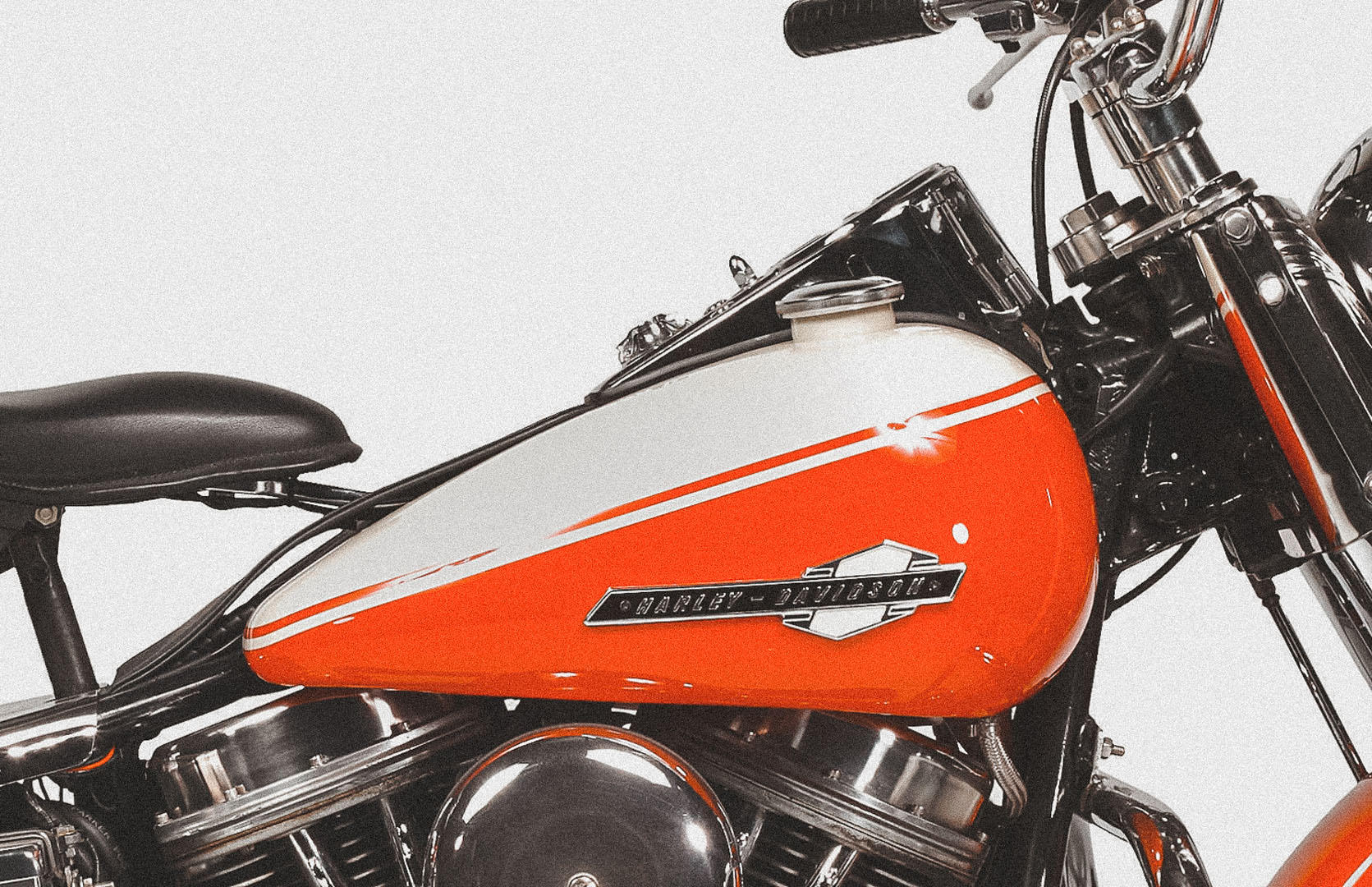
The 1964 tank emblem featured a unique up-and-down arrow design, symbolizing transition and movement. Introduced during the launch of the Electra-Glide and as the Panhead engine era came to a close, this emblem reflected Harley-Davidson's adaptability and innovation. Though polarizing among fans, the design became an iconic marker of a pivotal time in Harley’s history.

1969: The AMF Era Begins
Used from 1969 to 1972.
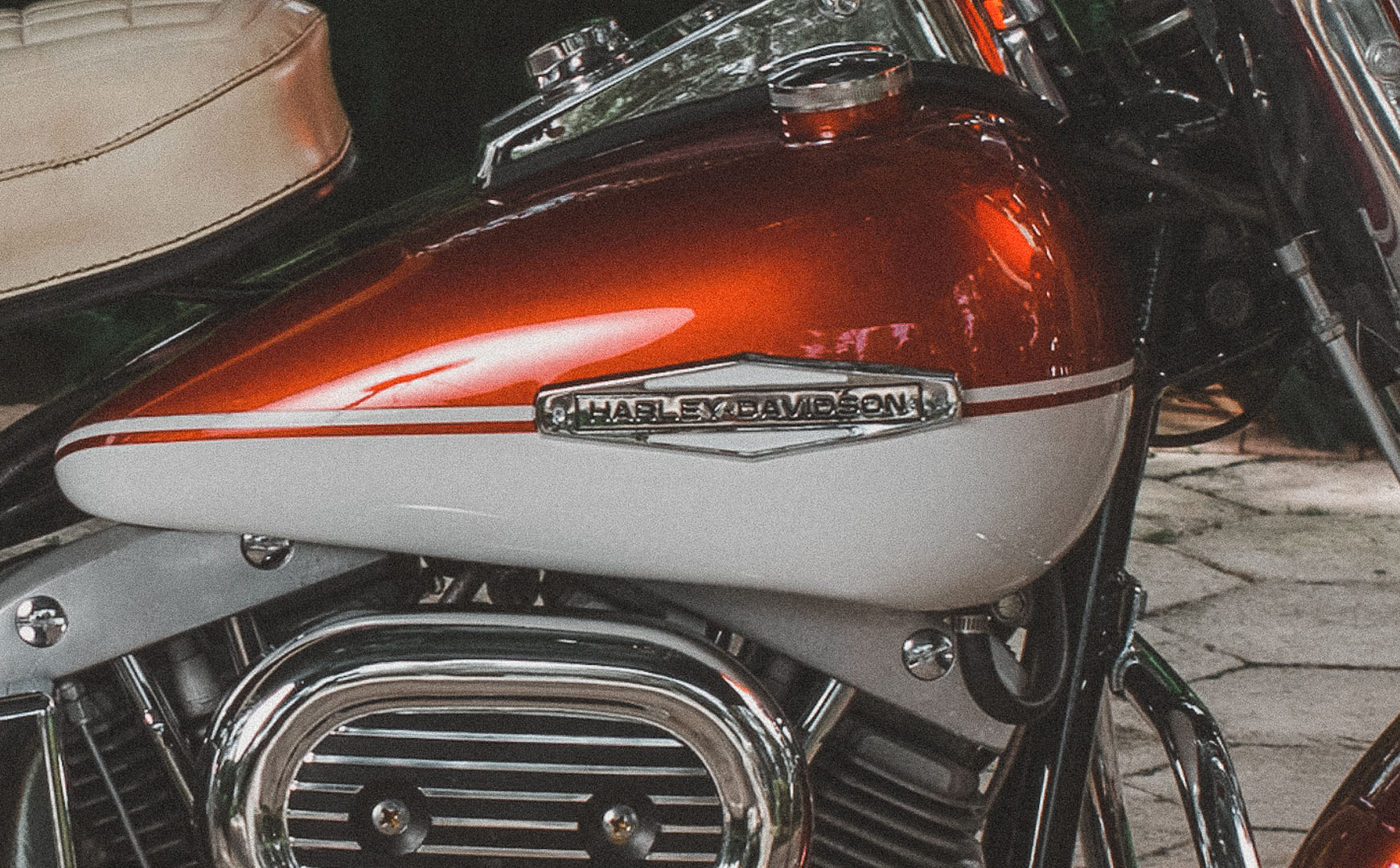
In 1969, Harley-Davidson entered a new chapter with its acquisition by American Machine and Foundry (AMF). While the tank emblems initially retained Harley’s classic style, this marked the beginning of a transitional period. By the early 1970s, AMF branding would start appearing on the tank badges, introducing mixed reactions among fans and foreshadowing significant changes in Harley-Davidson’s identity.


1972: The AMF Influence
Used from 1972 to 1982.
In 1972, Harley-Davidson tank emblems began incorporating the AMF logo, marking a visible shift in branding during the company’s ownership by American Machine and Foundry. The emblem’s design, often seen as out of place, faced criticism from loyal fans who felt it diluted Harley’s identity. This era reflected a challenging time for the brand, with the AMF label symbolizing corporate influence over Harley’s storied legacy.

1982: Back to Independence
Used from 1982 to 1988.
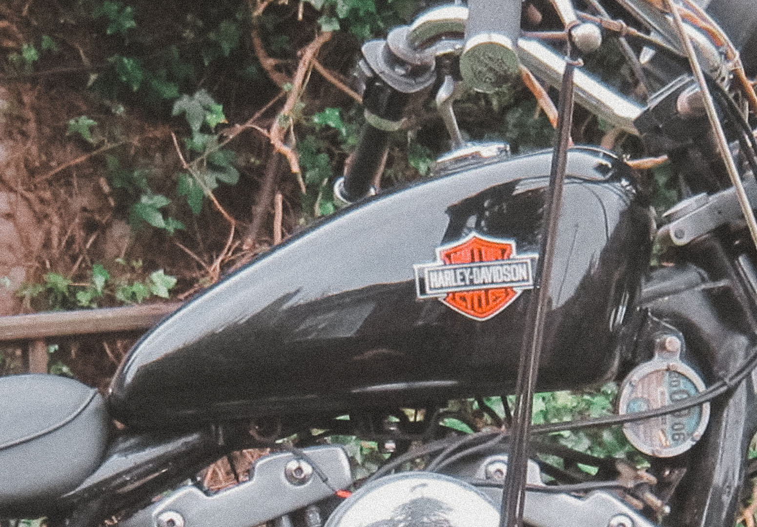
In 1982, Harley-Davidson proudly reintroduced its classic “Bar and Shield” logo on tank emblems, signaling its independence from AMF. This emblem marked a triumphant return to the brand’s roots, symbolizing resilience and a renewed commitment to American craftsmanship. The iconic design became a defining symbol of Harley’s heritage, celebrating its reclaimed identity and independence.


1988: Retro Softail Custom
Used from 1988 to 1993.
In 1988, Harley-Davidson embraced its heritage with a retro-inspired tank emblem featured on the Softail Custom. This design paid homage to classic logos of the past while appealing to a new generation of riders. The blend of nostalgia and modernity in this emblem underscored Harley’s timeless appeal, solidifying its place as a symbol of enduring American style and innovation.

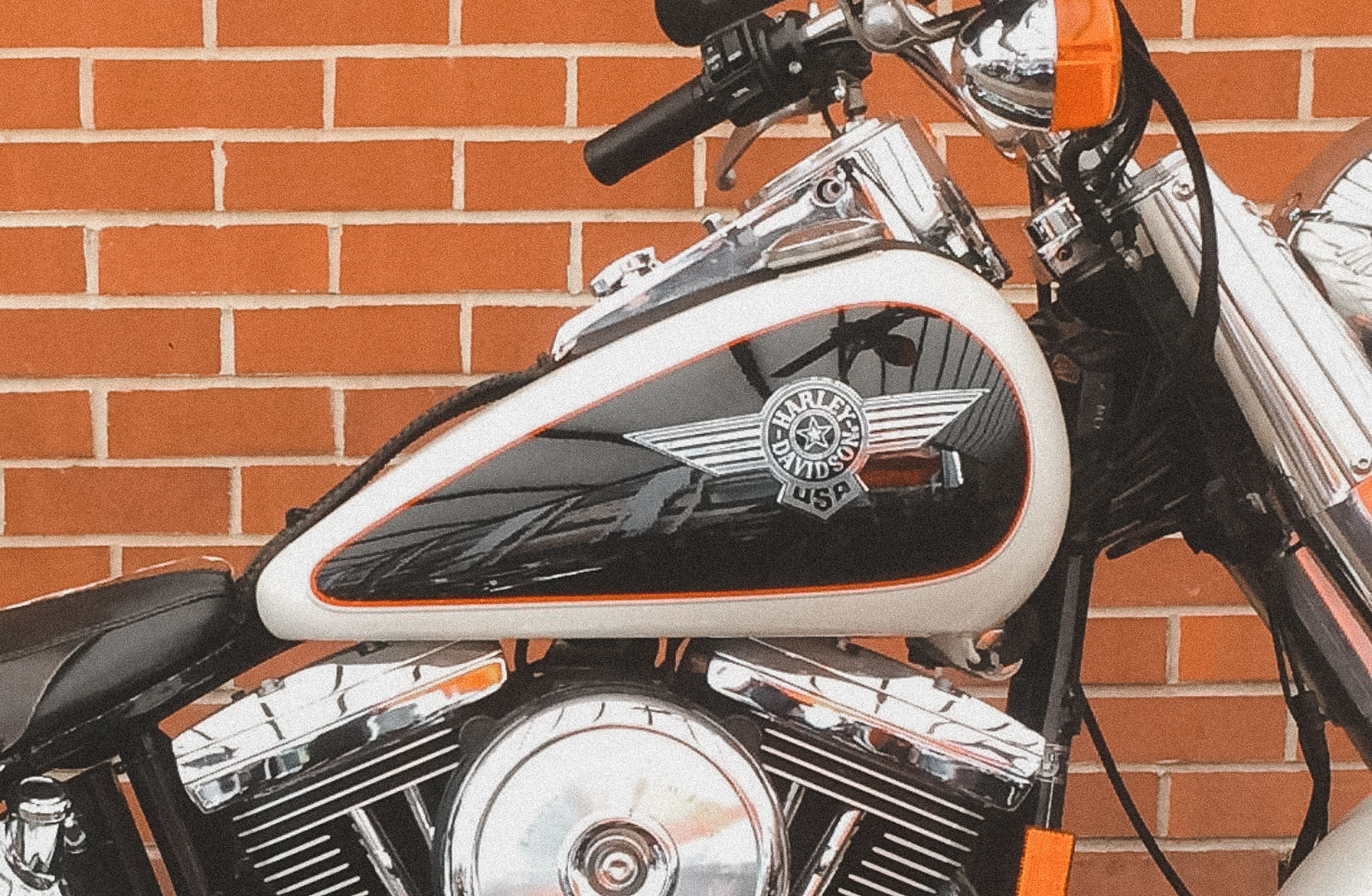
1993: The Winged Badge
In 1993, Harley-Davidson introduced the winged badge emblem for the special-edition “Cow Glide.” This aviation-inspired design symbolized freedom and adventure, themes deeply tied to the Harley-Davidson brand. As the final emblem of this era, the winged badge served as a bold and expressive nod to Harley’s legacy, closing a chapter in the evolution of its iconic tank designs.
Photo Reference - A Showcase of All the Tank Logos
This section provides a visual timeline of Harley-Davidson’s iconic tank logos, showcasing each design from 1919 to 1993. From the early hand-painted scripts to the bold, aviation-inspired badges, these emblems capture the essence of Harley’s evolving identity over the decades. Explore the artistry, innovation, and historical significance of each logo, with detailed photos that bring Harley-Davidson’s legacy to life. Whether you’re a fan, collector, or design enthusiast, this gallery offers a closer look at the craftsmanship and heritage behind these timeless symbols.
- 1919
- 1933
- 1934
- 1938
- 1946
- 1948
- 1951
- 1955
- 1958
- 1959
- 1962
- 1964
- 1969
- 1972
- 1982
- 1988
- 1988
- 1993
