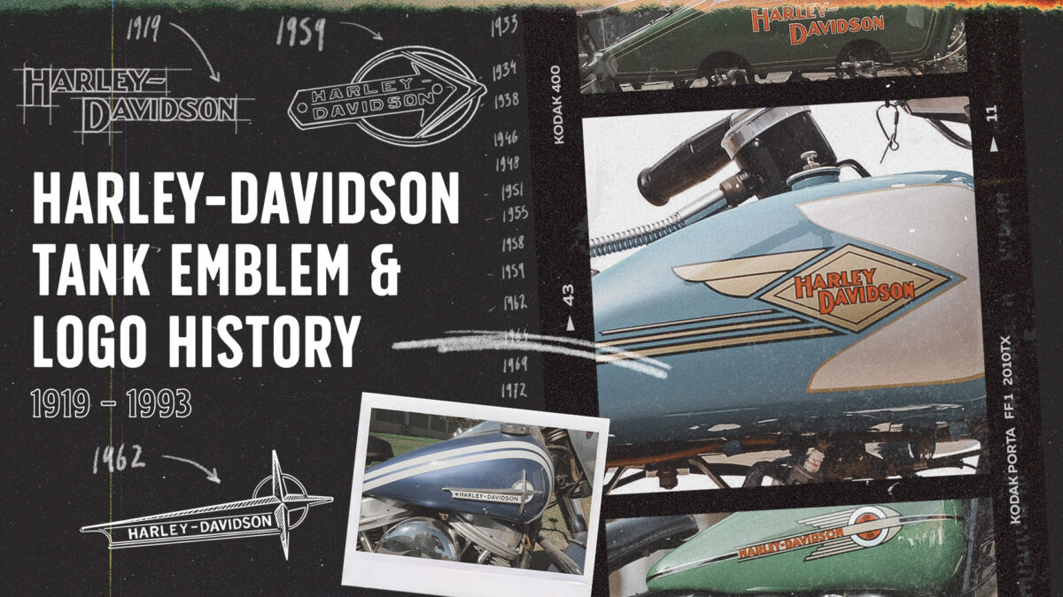
Harley-Davidson Tank Emblem & Logo History: 1919–1993
The Harley-Davidson tank logo has been a powerful symbol of American motorcycling heritage, evolving over the decades to reflect changes in style, technology, and cultural influence. Here’s a deep dive into some of the most iconic tank logos from 1919 to 1993.

1919: The Classic Beginnings - Early Script
By 1919, Harley-Davidson had already become a powerhouse in the motorcycle world. The tank emblem, a simple and bold "Harley-Davidson" script, was hand-painted on tanks. This design, with its clean lettering, set a timeless foundation that would echo through later designs.

1933: The Bird Motif
In the wake of the Great Depression, Harley-Davidson revamped its tank logo with a "bird-like" motif in 1933, surrounding the familiar lettering with a winged scroll. This decorative style added a new elegance to the classic Harley image. Although this design only lasted a year, it added a flair that represented the resilience and adaptability of the brand.

1934: The Flying Diamond
Just a year after the bird motif, Harley introduced the "flying diamond" design, which would become a recognizable emblem in the Harley-Davidson lineup. The flying diamond’s clean, geometric shape was a departure from the ornate scroll of 1933 and represented a new, forward-looking aesthetic that suited the Art Deco trends of the time.
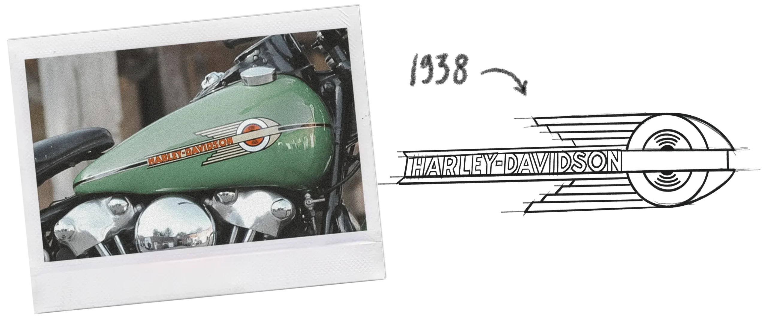
1938: The Streamlined Look
As Harley-Davidson prepared to introduce the Knucklehead engine, the 1938 logo took on a sleeker, more streamlined appearance. The design was clean, with a script that emphasized power and precision—qualities Harley fans had come to expect. This design marked a new era of engineering excellence, with the Knucklehead engine becoming a symbol of Harley-Davidson’s innovation.

1946: The First Metal Badge
In 1946, Harley-Davidson introduced its first metal tank badge, symbolizing a rugged post-WWII spirit. With World War II in the past, this metal emblem became a symbol of Harley’s commitment to quality and durability. Because of its brief use, this logo is highly sought after by collectors.

1948: Panhead and Hydra-Glide
The 1948 emblem saw a shift to a simpler design, which marked the beginning of the Panhead engine era. This design also introduced the Hydra-Glide front suspension, bringing modern engineering to Harley’s classic look. The simplicity of the badge mirrored the streamlined aesthetics popular at the time and spoke to Harley’s commitment to both form and function.

1951: The Script Era
Considered one of Harley’s most elegant emblems, the 1951 tank logo introduced a classic script style that set a new standard for Harley-Davidson’s brand identity. The stylish lettering exuded a sense of refinement and sophistication, which made this logo a favorite among Harley enthusiasts. In 1954, the underline was removed, giving it a more streamlined look.

1955: V-Twin Tribute
The 1955 design introduced a background with a bold "V," celebrating the iconic V-twin engine that had become synonymous with Harley-Davidson. This emblem underscored Harley’s identity as a manufacturer of powerful, high-performance machines, making it another fan favorite.

1958: Duo-Glide and Sportster Debut
The circular logo introduced in 1958 coincided with the launch of the Duo-Glide and Sportster models. This logo was often accompanied by two-tone paint schemes on fuel tanks, adding a custom look to Harley’s lineup. The circular logo also marked the beginning of an era when Harley started experimenting with new designs and color schemes.

1959: Arrowhead Emblem
Harley-Davidson introduced the arrowhead logo in 1959, adding a touch of color and detail to the tank design. The arrowhead shape suggested movement and speed, hinting at the power of Harley’s engines. The emblem was bold and colorful, becoming a hallmark of Harley-Davidson’s more expressive branding during this time.

1962: Gun Sight Logo
In 1962, Harley-Davidson introduced the "gun sight" logo, which was simpler and less colorful than previous designs. While some riders found it less visually appealing, it reflected a sense of precision and focus. The minimalist design remained on tanks until 1964 and represented Harley’s clean, no-frills approach to motorcycle manufacturing.
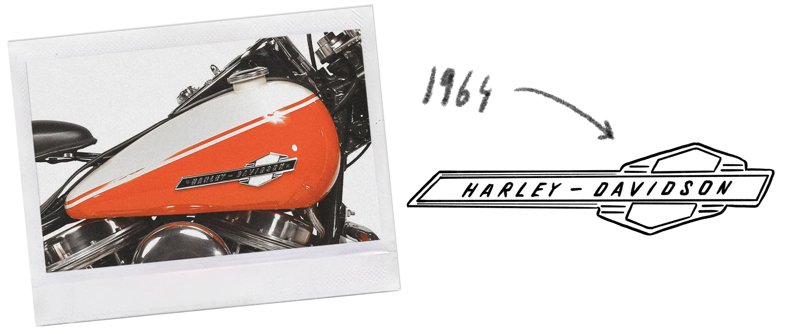
1964: Arrows of Change
The 1964 tank badge featured up-and-down arrows, a design choice that’s still debated today. The emblem’s quirkiness became iconic as it graced the first Electra-Glide and was the last badge on the Panhead engine before it was replaced by the Shovelhead. The design echoed the spirit of change and transition within Harley-Davidson.

1969: The AMF Era Begins
With the company’s acquisition by American Machine and Foundry (AMF) in 1969, Harley-Davidson logos took on a different character. The AMF branding, which started appearing on tank badges in 1972, was not particularly loved by Harley aficionados. During this period, the company experimented with different graphic styles, but the AMF affiliation often caused mixed reactions among fans.

1972: AMF’s Influence
The 1972 emblem included the AMF label, which many riders quickly removed. This was a challenging era for Harley-Davidson, as the AMF logo wasn’t well-received and felt out of place. Harley responded with multiple logo variations, reflecting the search for a new visual identity amidst corporate changes.

1982: Back to Independence
In 1982, after regaining independence from AMF, Harley-Davidson reintroduced its classic “bar and shield” logo on the tank, proudly free of the AMF affiliation. This symbol marked a return to Harley’s roots and celebrated its reclaiming of brand autonomy. It became a defining logo for Harley, representing resilience and a return to American-made independence.

1988: Retro Softail Custom
In the late 80s, Harley-Davidson embraced its history with a retro-themed logo on the Softail Custom. The logo, which paid homage to the classic designs of the past, celebrated Harley’s unique heritage while appealing to a new generation of riders. This blend of nostalgia and innovation helped cement Harley’s place as a symbol of timeless American style.
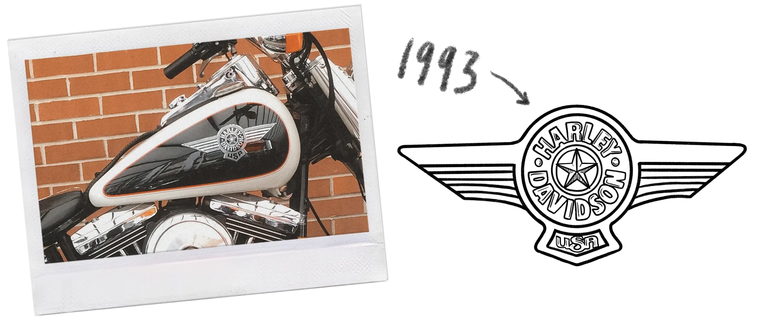
1993: The Winged Badge
In 1993, Harley-Davidson released the special-edition “Cow Glide,” featuring a winged aviation-themed badge that added to the motorcycle's appeal. This logo evoked the spirit of freedom and adventure associated with Harley-Davidson motorcycles. The winged badge was a final nod to the bold, expressive logos of the past, closing an era of Harley-Davidson’s classic tank emblem evolution.
